Mapping data in Power BI is straightforward when dealing with addresses or standard geographies like postal areas or counties. But what if your data involves custom areas such as police force boundaries or sales territories? And what if, after joining the data, you want to style the map to colour-code areas based on values from elsewhere within the dashboard? Following the the November 2024 update to ArcGIS for Power BI, you can!
The Join layer feature in ArcGIS for Power BI has been considerably enhanced allowing us to map Power BI data against any geography that we have in ArcGIS Online or ArcGIS Living Atlas. This could include non-traditional geographies, such as police force boundaries, North Sea regions etc. You can join this geography to your own data to create a visual representation in an ArcGIS Map! The new Best match feature gives you an indication of the compatibility between your own data and the data you would like to Join layer to before carrying out this analysis.
The update brought more styling capabilities to layers and added layer properties. These styling and property options include features such as clustering and heat maps. You can also change Labels and auto-refresh your layer. These new features work with and without an ArcGIS Online log-in!
Additionally, ArcGIS users now have access to layer visible range, layer transparency, feature information, and other new layer property categories.
To showcase the new features, I have some police crime data I would like to map, however my dataset is lacking a geography in which to map too. I can join my police crime data with a location dataset of police force boundaries to visualise it on a map. Then I can style the joined layer to highlight the areas with the most recorded crimes.
A Guide to using the new features in ArcGIS for Power BI:
Step 1: Upload your data into Power BI
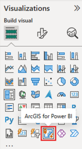
As explained in this Esri Knowledge Article, add your dataset which you would like to map into Power BI. Then add the ArcGIS for Power BI visualization from the Visualizations pane on the right.
Step 2: Add the Location dataset
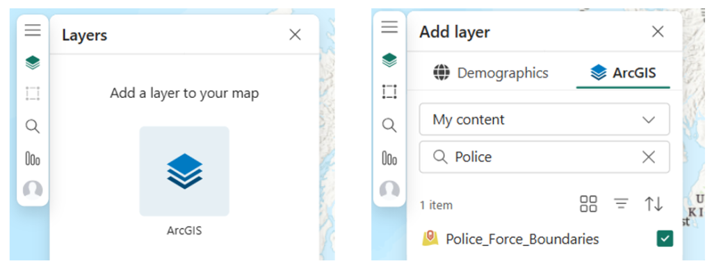
To add your location data, select the Layers tab within your map. You can add data from your ArcGIS Online content or browse through the many datasets available in Esri’s Living Atlas. In this example, I’ll be using a layer in My content which contains the UK police force boundaries.
Step 3: Conducting the join
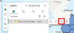
Now both of your datasets have been added into Power BI, click on More options (the three dots icon) beside the ArcGIS location data you just added to your map and click Create join layer.
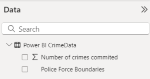
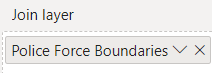
This will prompt you to “Add the Power BI Data to the Join Layer field well.” In the Data and Visualizations panes on the right, drag and drop the field you would like joined to the location data. I placed the “Police Force Boundaries” column as this is the field that I was like to join to another dataset in order to map this information.
Once you have added your data into the field well, you can then go back to the Analysis tab in the ArcGIS window and continue the steps there.
Under the drop-down menu in Feature Layer, chose which field from the ArcGIS data you would like to join to the Power BI data. This should be the field which both datasets have in common, for example a location name. This is the field that will be used to join the layers together.
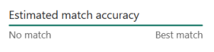
Once selected, the new Best match feature will present the estimate match accuracy before you join the layers. This will give you an idea of how well your two datasets will join together. My two layers will pair well and have therefore been estimated as “Best match”:
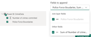
For the Fields to append drop-down, the fields need to be ticked on in the Data Pane to the right for them to appear here and be selected.
Now click Create join and check your results. You may need to turn off your other layers to see the join layer on its own.
Step 4: Styling the result
Now you have successfully joined your two layers in ArcGIS for Power BI, the recent update includes new layer properties and styling options to help visualise your data effectively.
To give my user a quick and easy visualisation of the crime data, I would like each Police Force Boundary polygon to be coloured representing the number of crimes committed within this area. For example, the stronger the colour red the more crime, the weaker the red means less crime. The boundaries with the most crime can then easily be identified within my ArcGIS map.
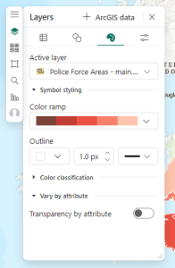
To do this, I need to go to the Symbology tab within the Layers pane, choose my new joined layer from the drop-down under Active layer, and then click Add field. I can then choose the field I would like to stylise and decide whether I would like my results symbolised by size or colour.
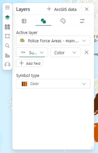
For more customisation, I can go to the next tab along – Style options – to continue to choose colours, outlines and specific colour classifications to suit my needs.
And here is my finished result within a Power BI dashboard:
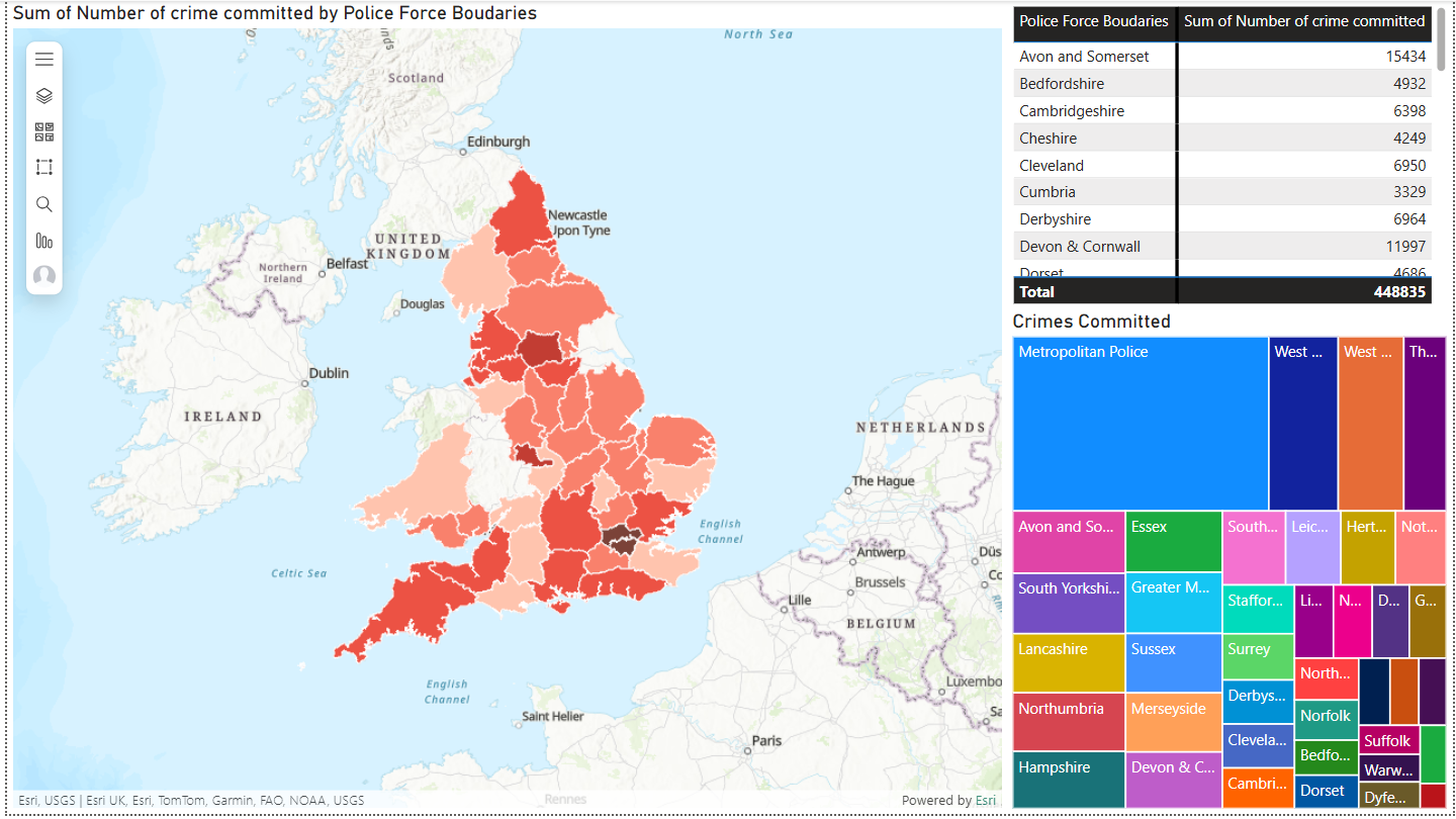
The police force boundaries with the highest number of reported crimes are shown in a dark red, boundaries with less crime are shown in light red.
I have successfully joined a layer with no location data to a layer with location data, to create one visualisation using the improved Best match feature within the Join layer functionality. I then customised the colour and symbology of my result, using the new styling and property options, to communicate crime data effectively and efficiently.
What possibilities will you create with your own data?
Please also watch this video to see how these instructions are demonstrated.