Tag Archives: Data Visualisation
Blending maps in ArcGIS Online
One of the newest additions to the Map Viewer Beta is blend modes. The Map Viewer Beta is the trendy new map making tool for ArcGIS Online, which provides an enhanced experience for key map authoring workflows. The Map, powered … Continue reading
Continue Reading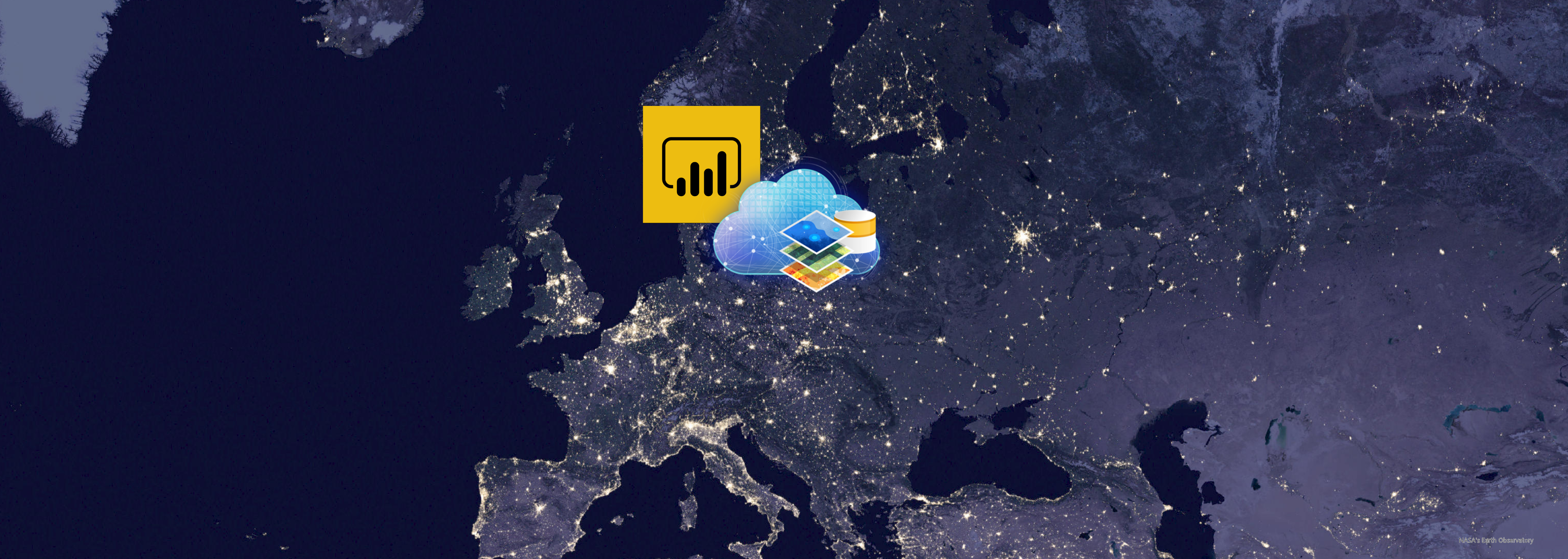
How to use ArcGIS with Power BI
Power BI is an excellent tool from Microsoft for data visualisation and dashboards. ArcGIS, from Esri, is also an excellent tool for data visualisation and dashboards. Can I use both? Absolutely. In fact, we encourage our customers to have both … Continue reading
Continue Reading
Certainty in Uncertain Times
Respond effectively to COVID-19 using authoritative, up-to-date data you can trust with absolute certainty.
Continue Reading
Just Add Ingenuity
Use out-of-the-box ArcGIS tools and a little imagination to help you respond to the challenges of COVID-19.
Continue ReadingThe UK’s Longest Rivers
Extreme weather events are becoming more common, more unpredictable and more severe. This is apparent all around the world. The flood events in the UK this winter forced many people to evacuate their homes. With World Water Day 2020 … Continue reading
Continue ReadingAbout bushfires, satellites and oil rigs
Over-sized fire symbols, misleading colours and poorly selected projections have all been front and centre in the recent spread of bushfire maps. Following yet another deadly bushfire event, a wide variety of maps have been created to reflect the damage … Continue reading
Eleven ways to map a General Election
It’s that time again; on 12th December, people across the nation will cast their votes to decide who will be the United Kingdom’s Prime Minister. Elections offer plenty of opportunities when it comes to mapping results, so I’ve been using … Continue reading
Continue ReadingMapping leisure choice in 30 minutes with OS Greenspace
To celebrate the arrival of the Ordnance Survey Open Greenspace dataset to the ArcGIS Living Atlas a number of us at Esri UK took part in a 30 Minute Map competition. I decided to map leisure activities and have put together a breakdown of the steps I used.
Continue ReadingWhat goes on in UK Waters?
The UK hosts the world’s busiest shipping lanes. Do you know what goes on in our waters?
Continue ReadingMarathon Magic: How to animate time in ArcGIS Pro
Read on if you want to learn the magic behind making our London Marathon race map animation.
Continue Reading