Blog Archives

How Stores Can Thrive—By Learning from Failure
A new study suggests companies have as much to learn from store closures as they do from expansions, and location plays a compelling role.
In Silicon Valley startup lore, one of the more famous stories focuses on how Blockbuster had a chance to buy Netflix for $50 million in 2000—and rejected it.
The rental video chain was then near the height of its powers, while Netflix’s DVD-by-mail business was struggling in a world dominated by brick-and-mortar sales.
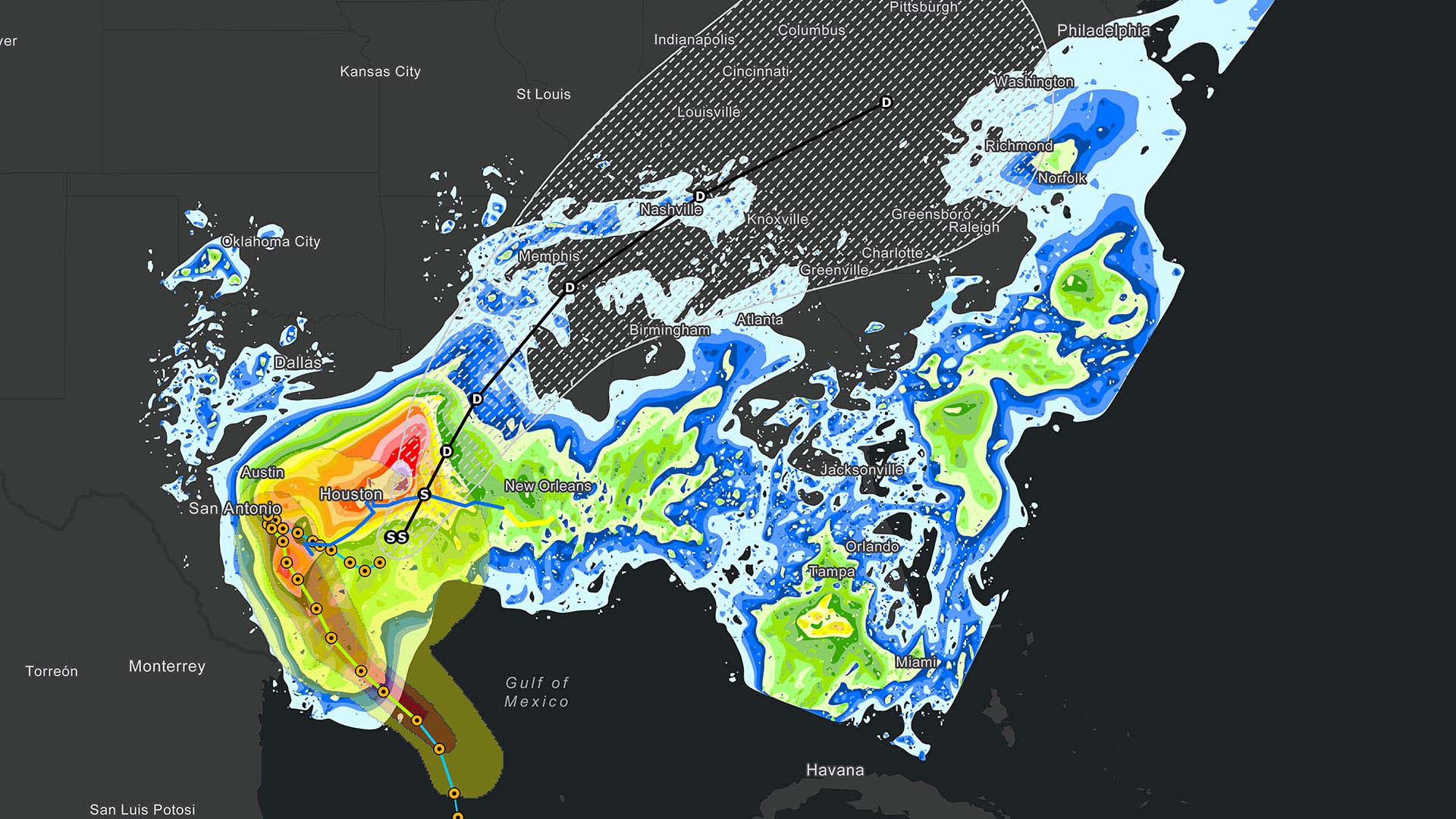
Article snapshot: Retail executives look for every advantage in competitive markets, and a study on the demise of one popular video chain offers clues they can use to place stores in the right locations.
When Netflix’s founders finally got a meeting with Blockbuster’s CEO and named their price, they were turned down and told the dot-com buzz was a passing fad.
Twenty years later, just a single Blockbuster store (in Bend, Oregon) remains of the network that once numbered more than 9,000, while streaming media pioneer Netflix sports a market capitalization of more than $240 billion.
It’s a cautionary tale of sudden technological change and fast-shifting consumer preferences—a reminder that in today’s unpredictable business climate, Davids and Goliaths can switch places faster than anyone might imagine. More and more, companies are turning to data analytics and tools like geospatial analysis to adapt before sweeping reversals of fortune take them by surprise.
Regional Transportation to Spark Regional Transformation
NAR is being pitched as a project that will spark needed changes in American society. It would help the US lighten its carbon footprint and mitigate future climate-related damage, proponents say, while providing inland transportation routes as an alternative to existing coastal corridors that could be imperiled by sea level rise.
Project planners also see a social equity angle to NAR. As large cities like New York and Boston have become more costly, the resultant housing crunch has pushed lower-income and middle-class workers to distant suburbs.
By expanding travel options throughout the region, NAR’s backers argue that families will gain more flexibility regarding where to live. For instance, a family could live on the NAR network, with two earners travelling in different directions to work, rather than being forced to choose a single metro area that may not offer ideal employment options.
This could have a profound effect on the regional economy and beyond—especially if North Atlantic Rail paves the way for other regional high-speed transit networks. For example, if NAR’s boosters are correct that businesses in the region could expand their trade areas as travel times decrease and more customers can reach them, it could change the calculus for retailers, commercial real estate brokers, and service firms planning locations and service territories.
Businesses can get a jump on these decisions by using GIS to visualize where changes are likely to occur. Combining demographic data with their CRM data, business planners can analyse how customer activity might change in areas newly served by NAR and other rail networks.
A Location-Smart Approach to Change
Large businesses in the Northeast are already struggling to understand how climate change will affect where their workforces will want to live—especially as NAR cities like Boston attempt to revitalize areas that will be impacted by climate-related issues in the coming years.
The COVID-19 pandemic and the switch to remote work have further complicated these decisions. Will tomorrow’s business leaders continue to embrace work-from-home practices or bring employees back to the office? Could NAR’s decentralization of the region provide companies and workers more flexibility—making it realistic to live farther away from the office while spending part of the workweek in the office?
Either way, as the climate crisis increases the need for large-scale solutions, projects like NAR are likely to set off changes in how people live, shop, and work. Location intelligence will help engineering and construction companies plan these major transportation projects—while helping retail and service businesses anticipate and accommodate the new customers those projects will create.
The Last Picture Show
Blockbuster is one of many indelible American brands that have disappeared from strip malls and city avenues: Borders, Radio Shack, Toys R Us, and others met a similar fate. Earlier this year, the US’s last remaining video rental chain, Family Video, closed its remaining stores after a long slump.
Retail executives and analysts typically focus on growth strategies and case studies of successful expansions when looking for lessons they can apply to their own business. But a research paper published last year in The Professional Geographer on Family Video’s decline suggests that business leaders have just as much to learn from retail networks that have contracted or failed.
The study’s authors concluded that site location and related factors can have a major influence on a business’s health and the viability of any given store. Their analysis found that occasionally overlooked external factors—local population density, neighbouring businesses, store size—can have a significant, surprising effect on whether a store stays open or is forced to close.
Increasingly, forward-thinking companies are incorporating a geographic information system (GIS) into their analyses to detect such patterns in location data that the naked eye and spreadsheets can miss. The business insight leveraged from GIS, known as location intelligence, can help corporate leaders gain competitive advantage, head off risk, and capitalize on opportunities.
Size—and Population—Matters
In the paper, Joseph Tokosh and Xuwei Chen of Northern Illinois University analysed data on Family Video closures to pinpoint underlying factors. The chain was founded in the Great Lakes region and expanded in rural and suburban areas where Blockbuster had less of a presence, reaching 700 locations across 19 states and Canada at its peak. At the time of the study, 537 stores remained open.
After studying elements like building size, population demographics, and proximity to other retailers, the authors came to three main conclusions. First, larger stores (on the order of 5,500 square feet) were more likely to fail than smaller ones. The specialized nature of the video-rental market, its simple product line, and the fact that the outlets didn’t anchor a market like a department store might, all favoured smaller stores seeing greater success.
Second, they found that the higher the density of population around the store, the more vulnerable the business was to failure. Denser populations tend to attract more shopping options, forcing a relatively small brand like Family Video to match prices and inventory with big-box stores like Walmart that also sell DVDs. Moreover, since sparsely populated rural areas often lack infrastructure for high-speed internet and the streaming media services it supports, those regions have typically performed well for brick-and-mortar video stores.
Lastly, the study concluded that the company a store keeps—its choice of cotenants and the status of neighbouring properties—was one of the biggest determinants of success. Nearby vacancies raised the likelihood of store closure. This finding dovetailed with data showing that stores in large plazas were more likely to shut down than stand-alone locations. Even a single vacancy can have an unwelcome effect, reducing the attractiveness of a shopping complex and triggering a domino-style chain of closures.
On the other hand, when Family Video locations had food or beverage outlets as cotenants, their likelihood of staying open increased. There’s an allure to pizza and movie nights that has endured well into the streaming era. When Family Video partnered with Marco’s Pizza, leasing space to the pizza chain in over 200 locations, the stores performed well: only 13 of those joint locations shuttered. Just as vacancies can pull a whole strip down, a popular restaurant can buoy the fortunes of the businesses around it.

With the insights gained from location intelligence, companies can craft strategies to get ahead of consumer patterns before the only option left is closure.
Location Data-Driven Strategies
By giving the kind of data analysed in this study a visual context, GIS makes it possible to detect, evaluate, and even forecast trends before they impact a business’s bottom line. For a business numbering 4 locations or 4,000, a GIS analyst can produce smart maps showing data in a geographic context and pointing the way to responsive business strategies.
A small-scale business like Family Video facing the prospect of nearby vacancies could preemptively transition the site to operate as a dark store—closed to the public, but acting as a mini fulfilment centre to fill gaps in e-commerce and omnichannel retail.
Alternately, an e-sports or video game chain might build a market strategy around the correlation between smaller populations and lower reliance on internet-based entertainment, seeking out exurban and rural areas for its locations. Those same geographies might also appear on a smart map as opportunities for an internet service provider looking to break down the digital divide.
The insight that cotenants can boost commerce for adjoining businesses could point to valuable partnerships. A GIS analyst can create a map showing sales at each store in a retail network and revealing patterns connected to neighbouring businesses.
No one knows the future, as the Blockbuster and Netflix encounter amply demonstrates. But for those with tools like GIS who understand the value of seeking out hidden patterns, there are many prescient ones hidden in the data.
This article was originally published on the global edition of Wherenext

New Life for High-Speed Rail
As the US gets serious about improving its infrastructure, high-speed trains are back in the spotlight, with new implications.
As the urgency to fight climate change intensifies, the United States is trying to bolster its efforts while also shoring up the nation’s aging infrastructure. President Joe Biden has pledged to spend $2 trillion on infrastructure improvements, with an emphasis on projects that promote an emissions-free future.
Article snapshot: US high-speed rail projects may get new funding as part of a massive infrastructure push. One effort in the Northeast illustrates the potential benefits of location intelligence and digital twin technology.
That could mean a push for better rail service, which has a lower carbon footprint than car-based transportation. Biden, a vocal supporter of Amtrak, has touted the idea of launching America’s “second great railroad revolution.” US transportation secretary Pete Buttigieg says he wants the country to become a world leader in high-speed rail.
An emphasis on location intelligence could help engineering and construction companies interested in joining the effort—as well as retailers, commercial real estate firms, and other businesses that might find new customers due to this once-in-a-generation shift.
Quickening the Pace in the Northeast
Although the US has a long way to go to catch up with countries like Japan and France, interest in high-speed rail is growing. For now, the country’s only high-speed rail project under construction is a link between Los Angeles and San Francisco, though other regional plans are being discussed, including routes in Texas, Florida, Nevada, and the Pacific Northwest. The most ambitious possibility is North Atlantic Rail (NAR), a $105 billion plan that would involve eight states. NAR could become the first megaproject of the Biden era, according to a recent Bloomberg CityLab article.
NAR is an attempt to expand and upgrade service in New England and New York, largely through modernization and electrification projects that would strengthen regional systems while extending service to less densely populated areas. It would include a high-speed trunk line transporting passengers between Boston and New York City in 100 minutes, 2 hours quicker than Amtrak’s current Acela service.
If the president’s infrastructure push helps make North Atlantic Rail a reality, it will present a formidable engineering challenge. The tunnel construction projects alone resemble the mammoth earth-moving and water-diverting efforts of an earlier American era. NAR would require new train tunnels under Boston’s infamous Big Dig subterranean highways; near Hartford, Connecticut, and in environmentally sensitive areas of the state’s eastern region; under a 16-mile section of Long Island Sound that would create the longest underwater tunnel in North America; and throughout New York City, including under the East River.
Companies hoping to work on these projects will need to keep them on budget and on time while managing the interplay between the built and natural environments without damaging existing physical assets. To accomplish that, they’ll need high-fidelity location intelligence. As Harvard researcher Doug Richardson explained in 2018 when he called attention to a federal report advocating work on infrastructure improvements:
Companies involved will need accurate and reliable spatial data . . . to ensure that scarce dollars are spent in the most efficient and effective ways possible. Knowing where infrastructure is located, how different pieces relate to one another, and where the critical dependencies lie are required first steps for making good financial decisions.
Engineering and construction firms have realized the benefits of location intelligence by using geographic information system (GIS) software and related technology. In fact, they have been among the most innovative users of the software, often managing projects with the help of a GIS-based digital twin.
A Digital Twin to Keep Rail Projects on Track
Planners of North Atlantic Rail have been influenced by the UK’s Northern Powerhouse initiative, a program to rejuvenate industrial cities in the North of England. A major pillar of that initiative is rail improvements, including HS2, a high-speed connection between Birmingham and London.
The planning and construction of HS2 are handled by a partnership of firms headquartered in Britain, Sweden, and Austria. The joint venture makes extensive use of GIS and building information modelling (BIM) technology.
GIS allows the companies to visualize critical details about networks above and below ground, and how key elements interact. GIS also lends geographic context to the buildings and structures managed in BIM, revealing their integration with the natural environment. The combined view is a project’s 3D digital twin.
As Harvard’s Richardson noted in 2018:
Employing technologies such as intelligent, real-time GIS and GPS maps to prioritize, plan, and execute new infrastructure projects can help optimize public and private infrastructure investments and avoid inefficiency and waste.
In addition to speeding up planning and enhancing accuracy, the 3D environment improves communication by providing a common reference document—accessible by engineers in the office and workers on-site. “It’s like a shop window for everyone on the project, to see what is available to them, and to give them easy and intuitive access,” a GIS manager on the HS2 project explained in 2019. “Giving everyone on the project access to the 3D models ultimately makes everything a lot more efficient, and saves time and money.”

Leading-edge firms are now adding the dimensions of time and budget to digital twins, using GIS and BIM to track not just how the physical project evolves but whether it honours deadlines and spending targets.
Regional Transportation to Spark Regional Transformation
NAR is being pitched as a project that will spark needed changes in American society. It would help the US lighten its carbon footprint and mitigate future climate-related damage, proponents say, while providing inland transportation routes as an alternative to existing coastal corridors that could be imperiled by sea level rise.
Project planners also see a social equity angle to NAR. As large cities like New York and Boston have become more costly, the resultant housing crunch has pushed lower-income and middle-class workers to distant suburbs.
By expanding travel options throughout the region, NAR’s backers argue that families will gain more flexibility regarding where to live. For instance, a family could live on the NAR network, with two earners travelling in different directions to work, rather than being forced to choose a single metro area that may not offer ideal employment options.
This could have a profound effect on the regional economy and beyond—especially if North Atlantic Rail paves the way for other regional high-speed transit networks. For example, if NAR’s boosters are correct that businesses in the region could expand their trade areas as travel times decrease and more customers can reach them, it could change the calculus for retailers, commercial real estate brokers, and service firms planning locations and service territories.
Businesses can get a jump on these decisions by using GIS to visualize where changes are likely to occur. Combining demographic data with their CRM data, business planners can analyse how customer activity might change in areas newly served by NAR and other rail networks.
A Location-Smart Approach to Change
Large businesses in the Northeast are already struggling to understand how climate change will affect where their workforces will want to live—especially as NAR cities like Boston attempt to revitalize areas that will be impacted by climate-related issues in the coming years.
The COVID-19 pandemic and the switch to remote work have further complicated these decisions. Will tomorrow’s business leaders continue to embrace work-from-home practices or bring employees back to the office? Could NAR’s decentralization of the region provide companies and workers more flexibility—making it realistic to live farther away from the office while spending part of the workweek in the office?
Either way, as the climate crisis increases the need for large-scale solutions, projects like NAR are likely to set off changes in how people live, shop, and work. Location intelligence will help engineering and construction companies plan these major transportation projects—while helping retail and service businesses anticipate and accommodate the new customers those projects will create.
This article was originally published on the global edition of Wherenext

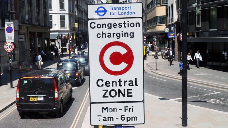
London: Maps, Location Technology Promote Mobility, Health
London transit agency Transport for London uses GIS for traffic awareness and sustainable transportation.
Twice in the last decade Londoners have seen dramatic shifts in the way they interact with streets and transit. The first was in 2012 when the Olympic Games temporarily brought 600,000 new riders to London’s buses and trains. The second was in 2020 when the COVID-19 pandemic emptied streets, buses, and rail cars. In both instances, planners at Transport for London (TfL) looked for near real-time understanding of traffic patterns, demand, and incidents using situational awareness from a geographic information system (GIS).
London transit agency Transport for London uses mapping technology to maintain traffic awareness and prioritize sustainable transportation.
Key Takeaways
- London traffic planners built on the pioneering system from the 2012 London Olympics to usher in leading-edge GIS for traffic awareness in the city.
- London’s transit agency uses awareness to flexibly adapt to COVID-19 realities.
- Data visualization guides an initiative to provide accessible, socially distant transportation options for Londoners.
In response to the pandemic, TfL had to reconsider how mobility can enhance public safety. During the Olympics, it had to move people around to many venues, while maintaining mobility for residents and businesses. New technologies implemented in 2012 would prove valuable once again in 2020.
Olympics preparation included standing up the Games Playbook, a comprehensive traffic management tool that served as a central source to visualize mobility. Reflecting on lessons from the games, Michelle Dix, director of planning for TfL at the time, told the BBC: “That’s the biggest legacy in terms of behavioural change. We proved that through messaging and communications and telling people what’s going on, telling them about alternatives so they can make informed choices, we proved that you can manage these big events.”
GIS technology has given TfL a chance to understand how street space can be reimagined for London’s residents—whether the challenge is to use the space efficiently for more people or use it safely for fewer.


The Olympics effort was deemed a success, with 90 percent of journeys completed on time despite a record number of riders. The London Tube alone had 4.5 million riders on one day of the games compared to the typical 3 million, and 30 percent more than usual over the course of the event.
In addition to catalysing the use of powerful traffic awareness technology, the Olympics kicked off a series of citywide initiatives to make healthy, sustainable travel options more accessible. Boris Johnson, then-mayor of London, pledged to maintain key elements of the walking, cycling, and public transit infrastructure created to support the games.
Now, public health is a top priority of Mayor Sadiq Khan’s 2018 Transport Strategy with the goal of 80 percent of trips around the city to be taken via public transit, on foot, or by bicycle by 2041.
TfL’s GIS services have been instrumental in these efforts.
“After the Olympics, the need for geospatial understanding still remained very much at the forefront,” said Jaymie Croucher, TfL’s GIS lead for Network Management, Surface Transport.
TfL invested in its GIS in 2014, delivering GIS as a service, and creating the Surface Playbook. “We’re six years in to a 10-year plan, and we continue to grow to support internal and external stakeholders—all fed through the single source of truth for data,” Croucher said.
Creating Space for Safe Streets during COVID-19
Since the emergence of COVID-19 in early 2020, TfL has faced a new challenge in support of social distancing and implementing London’s goals for active, sustainable transportation.
Using maps of city streets created in the Surface Playbook, TfL used funding from the Government’s Active Travel Fund to make more space for people to walk and cycle safely during the pandemic. The program’s intention is, “to support the members of the public to have more confidence to walk and cycle,” Croucher said. “It’s focused on supporting sustainable modes and increasing the ability to enact social distancing in transit, whilst limiting the impact of other modes.”

The program encompasses several connected projects, including widening walkways, creating temporary bicycle lanes, and restricting car traffic near schools and in designated low traffic neighbourhoods. Projects have been implemented citywide on the 360 miles of roads managed by TfL as well as locally through funding provided to London’s boroughs.
As all the projects took shape, Surface Playbook was utilized as the focal point to giving clear situational awareness across the business as schemes were proposed, planned and delivered. “There’s a limited amount of space in London, and our team had to act quickly and use it wisely,” Croucher said. “We needed to look at social distancing and find out where it was going to be the biggest issue.”
The team’s principal data manager and GIS specialists (Christophe Delatreche, Timothy Fegan and Christina Kimbrough) along with the data scientists of Operational Analysis, created products identifying at-risk and high-demand areas of pavement to give planners a clear indication of priority areas. In particular, the maps highlighted five factors: areas with current high demand for cyclists and pedestrians; essential services like grocery stores; population density; median household income (low income typically correlates to higher foot traffic); and high-traffic public transportation hubs. As a whole, the maps conveyed a clear picture of where streets were likely to be crowded—and where more space was needed most for safe and socially distant activity.
The resultant risk assessments could then be layered over data like walkway widths to create priority scores. Top priority was given to streets and neighbourhoods with both the need and capacity for wider walkways. “This enabled the business to have a clear understanding of precedence enabling clearer decision making prior to accepting schemes.” Croucher said.
Similar processes informed additional schemes like added space for social distancing at heavily trafficked bus stops and establishing 24/7 bus lanes on priority routes.
TfL also coordinated with the GIS team within City Planning, led by Vicki Gilham, to expedite existing plans for cycle lanes created under London’s broader transport strategy. Prior to the pandemic, Croucher said, “Where previously we had seen cycling programs paused pre-pandemic, we’re now seeing those accelerated in areas where there’s an increased need for cycling infrastructure.”
Mapping the Future of London Transit
While the efforts align with London’s long-term goals, many schemes introduced during the pandemic are currently considered temporary. TfL is working to report on the success of each scheme to gauge whether the changes will make sense for the city after the pandemic—much like the process for maintaining Olympics infrastructure following the games.
“Before we can decide whether a feature becomes permanent or not, we need to understand what the impact is,” Croucher said. “If you close a street, for example, that is going to cause traffic to develop elsewhere. The schemes need to be well monitored to ensure that they’re effective in the long run for all modes of transport.”


London’s streets see over 25 million trips per day via many modes of transit. TfL’s long-term traffic strategies, informed by GIS data, help manage congestion, maintain safety, and encourage greener, healthier transportation.
Onsite surveys have been a key component of the monitoring process. Surveyors in the field across the Greater London area capture data about use, safety, and needed improvements. Survey feedback populates a live, online GIS dashboard, providing real-time visibility for city management and informing next steps.
To that end, such shareable reporting tools have supported TfL during the pandemic. With many schemes also being carried out by boroughs, the team created a GIS database to centralize program information.
“Compiling it all within a single portal, we’ve allowed everyone to have transparency over the safety of each scheme and compliance of users,” Croucher said. The portal delivers situational awareness for TfL and city leadership to see how each scheme performs and interacts.
Changing a city’s transportation habits ultimately requires a strategic rebalancing of the way residents use city streets. Recreation, public transit, transportation of people and goods—each claims a space on city streets. Giving more space to one will necessarily take space from another.
Maps provide a powerful visual understanding of the space available and a strong platform to plan, prioritize, and improve.
“The benefits of the way we collect and disseminate this information are reaped well beyond TfL to provide clarity to both external partners and ultimately the public,” Croucher said. “Understanding the spatial relationships that elements have provides a clear picture for decision makers that you won’t necessarily see by looking through more traditional means such as a database or a spreadsheet.”
Learn more about how GIS is used to make transportation more efficient.
Location Information at the Center of Traffic Management
The Network Management department at Transport for London (TfL) delivers GIS as a service (GISaaS) to many different departments and enterprise systems. The data and layers captured in TfL’s geographic information system describe locations and things, including up-to-date details about roadways, rails, paths, and all the physical assets it maintains. Sharing this capacity as a service means other systems can ingest and build on authoritative data to visualize, query, and analyse it for specific purposes.
TfL undertook a major digital transformation in 2016, with its Surface Intelligent Transport System (SITS), an umbrella project that modernized traffic signals, incident management, and the coordination of road improvement.
TfL’s GIS as a service directly feeds its adaptive traffic signal system. Data from sensors in the road network feed the split cycle offset optimization technique (SCOOT) model that analyses volume second by second. Buses and their location in the queue are also modelled and monitored. Then, the model feeds junction controllers in real time to adjust traffic signal timings to take advantage of each road’s volume versus capacity and to coordinate flow with neighbouring roadways.
TfL’s operational knowledge, captured in GIS, helps improve traffic flow and the environment for walking and cycling. One of the traffic signal innovations tested during COVID-19 involved “trialing the Green Man Authority,” where pedestrians see a continuous green man until a vehicle approaches.
GIS and the SCOOT system also feed an advanced big data analytics tool to understand dynamic changes in road traffic. The Real Time Origin Destination Analysis Tool (RODAT) analyses feeds from video cameras at key locations and along major routes in central London. The system monitors more than 20,000 origin and destination pairs every 15 minutes to calculate actual journey times and traffic flows to keep London moving.
GIS is also at the centre of TfL’s LondonWorks system for coordination of road improvements, with a registry of all road works and street-related events, both planned and current, in the Greater London area. LondonWorks maps all incidents, and uses spatial analysis to assess road networks then coordinate various road works to minimize congestion.
All inputs are combined in TfL’s Traffic Information Management System (TIMS) to monitor and manage traffic using a GIS database of live and planned traffic disruptions in London, including congestion, traffic incidents, repair work, and events. TIMS allows media agencies and other stakeholders to view disruptions in real time (updated every five minutes), and to see information about planned activity likely to impact traffic—providing a shared situational awareness.
This article was originally published in the the Esri Blog

How to end the ICE age and keep Electric Vehicles moving
Electric Vehicle (EV) charger installations are not keeping pace with demand. Stakeholders need to choose the right locations quickly and confidently. Geographic Information System (GIS) mapping technology is accelerating the decision-making process.
Have you ever been “ICEd”? It means to pull up to a charging bay for an electric car only to discover it occupied by a car with petrol or diesel Internal Combustion Engine.
It's more than a bit of slang. Fear of ICE is a nightmare for the Electric Vehicle (EV) industry. Drivers are terrified of running out of juice mid-journey – it is the number one reason for not buying one.
The industry is obsessed by solving it. Charging is the last obstacle for electric cars on their road to world domination. The performance is already spectacular. The speed of electric cars is jaw-dropping, or should we say spine cracking. The Tesla Model S can out-run a Ferrari California or Lamborghini Aventador.
By 2021, Elon Musk predicts the Tesla Roadster will be the fastest production car ever built, with 0 to 60 in 1.9 seconds. Stats like this are so good even Jeremy Clarkson, long term critic of EVs admits: “The electric car is coming. Be in no doubt about that...Saying it won’t happen is not even worthy of a metaphor. It will.”
In absolute terms, range is decent, and growing. A Nissan Leaf will do up to 239 miles on a single charge, enough for London to Manchester. The quality of EVs is so good the UK government recently pulled forward the ban on the sale of new petrol and diesel cars from 2035 to 2030.
So - how to solve the ICE problem? Easy! Accelerate the rate of charger installation. How to crack it? That's currently a job being done using Geographic Information System (GIS) technology – computer software that harnesses geography and maps to supercharge the exploration, analysis, modelling and reporting of potential charger locations. Accelerating the speed to insight is where GIS comes into its own.
Where should the chargers go?
The responsibility falls to a long list of government bodies: Highways England, Transport Scotland, the Welsh Assembly, and Transport for London in the capital. Furthermore, each council is responsible for its own patch.
And the private sector is a big part of the equation. Traditional filling station companies are switching from traditional fuel to electricity. Shell UK recently launched Project Evelyn - electric only forecourts described as “an energy hub where you can recharge yourself and recharge your car”. One in three Shell transactions are shopping, not fuel. The extended charging time of EVs is a huge opportunity to sell more. A spokesman explained:
“While they wait for their car to recharge, we expect customers to want to catch up with their shopping, have a coffee or, where space allows, do something like click and collect. We call it ‘taking care of yourself and your car’.”
GRIDSERVE used ArcGIS as part of the research project to identify the location of their first all-electric service station in Braintree, and is now partnering with Ecotricity to locate more service stations on the UK Electric Highway. BP Chargemaster is partnering with Marks & Spencer to offer charging bays in store car parks. And there is growing competition from EV-specific networks such as Chargepoint, InstaVolt, Engenie, and Pod Point. The cost is significant: Engenie raised £35m to install 2,000 chargers by 2024.
The problem is the sheer number of chargers needed AND the speed at which they need to be installed. Just look at the numbers. The UK currently has 37,589 chargers in nearly 14,000 locations. Sales of electric vehicles in the UK increased five-fold in the year to December 2020, according to the Society of Motor Manufacturers and Traders, as diesel sales plunged 55 per cent. By the end of the decade all new vehicles will be wholly EV or hybrid in a nation with 33 million cars on the road. That's a lot of chargers needed. And right now more than a hundred local authorities offer fewer than ten chargers per 100,000 citizens.
Drivers can explore charging locations via this map, created with data from the Open Charge Map. The graphic reveals just 8.56% of charging points in London are classed as rapid. This contrasts with 28.46% classified as rapid in Greater Birmingham and 43% in Leeds.
In Greater London there is 1 rapid charging point for every 48,201 people.
It's a make-or-break national challenge to meet the surge in demand. And with the sheer number of stakeholders involved, it’s critical that they quickly and confidently choose the right locations. Finding the right location for a charger is notoriously hard – but when you use GIS those decisions can be made much faster.
For example, Waltham Forest council in London is installing chargers connected to lamp posts. These are small and located roadside, feeding off the existing lighting infrastructure. Simple? In fact, Waltham Forest calculate they'll need to:
- Consider whether lamp column infrastructure is appropriate for the chosen location
- Ensure lamp columns are at the front of the pavement, to avoid trailing cables and liability implications
- If a lamp column is back of footway, allow adequate footway widths for bollard at front of footway
- The optimal use of lamp columns requires two or three lamp column chargers on each street to ensure residents are always able to access a charging point; there needs to be enough suitable lamp columns on each street under consideration to meet this requirement ensuring charging point locations chosen are resident led in areas of existing demand and where there is likely to be future demand
- Ensuring columns are practical for the installation of the infrastructure – columns must adhere to a prescribed standard of earthing, increasing the fuse size to cope with the extra energy usage, and metering an otherwise unmetered energy supply. Also require steel lamp columns, not concrete ones
- Adequate space and no apparent services within 700mm of the lamp column to accommodate earthing mats
- Does not require a fixed/marked dedicated EV only bay
Only an advanced GIS platform can map out and analyse all these variables to determine the best locations.
ArcGIS is the solution. It's the perfect platform for identifying the ideal spots. ArcGIS combines a vast library of map layers, with spatial analysis tools, and highly specific datasets. The Esri Living Atlas library within ArcGIS is the foremost collection of geographic information from around the globe. It includes more than 8,500 maps, apps, and data layers all ready to be fed into a unified model. Third party data can be introduced with ease, to create the best possible database.
The Living Atlas includes infrastructure data, such as the UK Road Network and Crossrail route (Crossrail was designed using ArcGIS). Environmental data covers risk of flooding via The Rivers Trust and protected areas from Natural England.
Existing charge points are supplied via the Open Charge Map, a public registry of EV charge points. Open Charge Map is supplied as a layer in ArcGIS. Furthermore, Ordnance Survey road maps and Land Registry data for precise data on the distance between buildings and road.
Demographic data, via the Office for National Statistics, shows where residential demand is situated. For example average UK household size reveals residential concentration. Movement data, via location data derived from smartphones, offers a granular insight into the routes drivers take. Planners are able to position chargers exactly where road users need them.
Then there's the issue of power supply. The higher the voltage the faster the car charges. It's possible to install a variety of power ratings. These include 7 kW, 15 kW, or ultra-rapid 100 kW. The new generation are 150 kW or 350 kW. A higher rating is preferable, but a bank of ten 350 kW chargers will need a small power station to supply them. It's why the first 350 kW in the UK was installed only in 2019.
Utility companies must map out the network (including cabling, substations, converters etc) to ensure new charging points don't overload the grid. ArcGIS is the preferred platform for UK utilities majors to keep track of grid layout, and current and project demand from customers.
Retailers must also be considered. Shops and retailers can benefit by supplying charge points to bring in footfall. A motorway service station equipped with EV chargers can look forward to customers with 30 to 60 minutes to kill. Retailers see installing chargers as a huge commercial opportunity. Again, ArcGIS offers retailers a way to systematically analyse their real estate and neighbourhood to identify spots for upgrading with EV chargers.
Even mining lithium deposits required for batteries is dependent on GIS. Satellite imagery, remotely sensed Lidar data, and point cloud maps created by drones, are fused together by mining companies for a complete picture.
So GIS really is helping keep EVs on the road.
“GIS is accelerating the electric vehicle roll-out at every stage,” says Chris Jackson, head of commercial markets and sustainability at Esri UK. “From exploration in mining, supply chain sustainability, distribution and retail – companies are adopting GIS to transform their ways of working. Councils and Utility companies are using GIS to locate new chargers and charging service stations. And the biggest benefit is the speed at which all these decisions are being made. You don’t get that from spreadsheets or data alone – your understanding accelerates when you see your business in a real-world context – using maps as the ultimate digital twin.”
He adds:
“The UK government’s commitment to net zero by 2050 demands that we switch to electric vehicles as fast as possible. The cars are fantastic. The missing link is the availability of chargers. Of course it’s an inherently geographic problem, and the contribution we’re most proud of is the acceleration of thinking and decision-making – what used to take days now takes seconds – and that’s really what will help us beat the challenge.”

Chris Jackson - Esri UK
Chris is a geographer who is passionate about the environment and creating sustainable businesses & communities. Chris has spent over 25 years in high-tech software industry working with mapping and geospatial technology for government and private sector organisations as a technician, consultant and manager. He joined Esri UK in 2001 and holds a Senior General Management position covering a diverse group of industries, delivering solutions to enable Digital Transformation & Sustainability.

Digital Twin of the Globe Helps Companies Get Ahead of Climate Risk
A new predictive modeling technology helps organizations understand how climate change could disrupt global supply chains decades from now.
In locations around the world, the impacts of a changing climate are increasingly hard to miss. Rain-swelled floodwaters rise over railroad tracks, halting trains loaded with consumer goods. Landslides choke roads, forcing cargo trucks to reroute on the fly. Firestorms threaten data centres that process millions of e-commerce transactions.
Natural disasters and adverse weather events triggered by global warming are not limited to any one region or industry today, but pose threats throughout the supply chain, creating huge challenges for COOs and other business leaders in retail, manufacturing, insurance, utilities, and beyond.
Climate-related interruptions to the international flow of goods—which is worth roughly $20 trillion—slow the delivery of food, medicine, and materials like computer and auto parts, and can result in billions in economic loss. The interconnectedness of the global market means that rising sea levels in Vietnam, for example, can have a direct bearing on the sale of AirPods or Nike shoes in Moscow or San Francisco.
Among forward-looking businesses, a new effort is afoot to navigate disruptions by leveraging data analytics and simulation-based location intelligence that forecast climate trends next season or decades into the future. By studying their supply chains in detail, companies are quantifying how resilient they are. Where they identify vulnerabilities, they are taking pre-emptive action to mitigate potential impacts and adapt to future conditions.
“Across all industries, we’re getting [the question], ‘What can you tell us about climate change? How resilient are we?’” says Stephen Bourne, a lead resilience modeler, engineer, and project director at Atkins, an engineering, design, and project management firm and member of the SNC-Lavalin group.
Article snapshot: Business executives crave predictability, and a new simulation-based system uses GIS technology to predict where supply chain vulnerabilities could emerge months and years in the future.
Locating Tomorrow’s Trade Danger Zones
Location intelligence—a form of business intelligence derived from a geographic information system (GIS)—plays a prominent role in managing climate risk and supply chain continuity. With GIS technology, analysts can create smart maps that layer climate information, hazard data, and satellite imagery on the regions and networks that compose a business’s supply chain. The insight produced by such maps—like those used by AT&T or the City of Boulder, Colorado—can help business and community leaders make decisions to reinforce or relocate coastal facilities in areas where storms will increase, for example, or allocate more funds for floodplain management.
Armed with GIS technology and artificial intelligence models that sharpen predictions, some companies are taking this forecasting to new levels of clarity. One such innovation is the Seaport Simulator developed by Atkins. The program applies predictive analytics, powered by global-scale simulation, to historical weather data and the latest meteorological research. The resulting model, Bourne says, creates thousands of climate scenarios across GIS maps of an organization’s supply lines. The simulations yield location intelligence showing how factors such as tropical storms or extreme temperatures might slow or disrupt the flow of shipping containers over sea and land from now through the year 2050.
“One of the most powerful things you can do is show the consequences of decisions a company makes about how it manages its supply chain over the next 30 years,” Bourne says.
The Seaport Simulator does not purport to tell decision-makers the future, but assigns probabilities to a staggering number of possible climate and cargo-flow outcomes. It presents users with the likeliest eventualities, accompanied by an estimated margin of error.
Protecting Supply Chain Infrastructure—and the Bottom Line
The program essentially creates a digital twin of a seaport or trade area, including all the transportation modes linking it to goods producers and consumers around the world. The digital twin uses 3D modelling, remote sensing, and thousands of points along a supply chain to create a dynamic visual of what might otherwise be dry statistics on paper. Its sophisticated simulation models and level of detail are such that a supply chain manager could see how an investment made next year might be affected by spring rainfall in 2030 on a specific section of train tracks.
The GIS-based simulator grounds smart business strategy on a foundation of location intelligence and hard data. In addition to helping protect supply chain infrastructure, the technology can help safeguard a company’s bottom line. A CFO could use the simulator to measure return on investment from capital infrastructure projects—like raised roads or railways or reinforced bulkheads—against the potential cost of not taking action. In a budget meeting, a map-based simulation comparing scenarios could be the difference between achieving and not achieving desired funding for climate resiliency.
“Executives look at this as a treasure trove of information that they can use to make decisions much better than they’re currently making [them],” Bourne says. “The more information you can get to them, the better.”
A Port Simulates Its Future
The first client to use the Seaport Simulator was the Port of Prince Rupert—Canada’s third busiest seaport, responsible for almost 40,000 acres of landholdings and harbours along British Columbia’s North Coast. Shipping over 32 million tonnes of import and export cargo per year, the port is connected to railways and shipping routes from Canada and the US to China, South Korea, Japan, and beyond. The supply chain hot spot is also subject to rugged weather conditions: the surrounding region sees the second-highest rainfall in North America, multiple hurricane-force storms a year, and a 25-foot tide swing.
With the help of funding from Transport Canada’s Transportation Asset Risk Assessment (TARA) initiative, the port contracted Atkins to help pinpoint where infrastructure in the port and cargo movement across its global network would be most exposed to climate risk. With insight from the location intelligence generated by the Seaport Simulator, they could make better decisions about their own operations, and pass those insights on to their stakeholders, including the terminal operators, shipping companies, and transportation conglomerates that rely on the port.
“International transpacific trade is critical to our economies,” says Jason Scherr, manager of environmental sustainability at the Prince Rupert Port Authority, who worked with Bourne and Atkins to tailor the simulator’s algorithms to the seaport’s needs. “Climate change and potential future impacts are always on our minds. Everyone is thinking about it, whether you’re a shipping company, a port, or someone running a trucking company. Our intent with the project is to look across our entire port complex and into the future to gain a better understanding through the data analysis and modelling.”
Potential climate-related impacts could be related to sea level rise, rainfall, winds, extreme temperatures, and tropical cyclones along ocean trade routes. Conceivably, all those variables could affect a single journey of cargo. A ship departing from Hong Kong might be delayed or have to reroute because of hurricanes whirling across one stretch of the Pacific Ocean, and forced to speed up to outrun similar storms in other waters. Sea level rise and high winds could interfere with port operations and docking procedures as the cargo ship approaches Prince Rupert. And finally, once the containers have made it onto trains heading toward cities like Chicago, their progress could be interrupted by ice and freshets (flooding from melted snow), landslides loosened by rain, and rail operations slowed by extreme high and low temperatures.

You can create a scenario where you elevate a track and then rerun the [model], and you can measure, ‘What is the impact of doing that?’ and start to estimate your return on investment and make the case for why you should act now instead of waiting for it to be a problem.
Stephen Bourne, Atkins
A GIS-Enabled View, from Harbor to Continent
Bourne’s team at Atkins used weather forecasts from the latest global climate models and findings from recent climate research efforts to drive the simulation. Based on those inputs, the GIS digital twin identified points along the cargo journey where weather or climate-related events might interfere.
Learn from the Analytics Experts
For a behind-the-scenes look at two successful analytics teams, check out the WhereNext webcast with TD Bank and Grange Insurance March 23 or on demand.
The team then used powerful multi-core computers to run massively parallel simulations to determine the probability that climate activity like storms or floods would increase or decrease at those critical locations over the course of the next 30 years. By using simulation technology to model tens of thousands of such runs, the simulator established the range of possibilities that the seaport should be concerned about.
The Atkins team also used overhead lidar imaging to capture 3D images of the port’s buildings, roads, docks, and rail lines—ultimately building a highly detailed representation of the port in GIS. This digital twin made it possible to study how climate projections would affect port operations on a facility-by-facility basis. A high level of accuracy was essential to ensuring that the model could tell seaport administrators specifically where they may have trouble spots and what they needed to do to mitigate and adapt.
Interestingly, the analysis revealed several bright spots for the port, showing that global climate change dynamics may actually result in fewer impacts for the port’s supply chain, and that the operational style the port has developed to tackle its current climate has prepared it well for the specific impacts it is likely to face. “Climate change impacts are very location-dependent,” Bourne says. “There’s no sort of general statement you can make about how climate change will affect all places.”
Simulating Climate Risks and Opportunities
Bourne stresses the importance of accuracy and detail in studies of sea level rise. Due to the complex hydrodynamics of the port, and depending on the time of day, the water level on the north side of the island where the port is located is generally about eight inches higher than the water level on the island’s south side. That detail might sound insignificant, but depending on flood inundation levels, eight inches might end up determining whether a port remains operational or has to shut down. Fortunately for the Port of Prince Rupert, the simulations showed minimal future impacts from sea level rise. Location intelligence is the only practice that delivers this insight.
The Data and Speed behind the Tech
To create massive and integrated simulations of the global supply chain, the Atkins team used findings from large-scale, detailed climate studies, including global circulation forecasts that model future weather patterns. Atkins’ innovation was to use location intelligence and sophisticated simulation to assess the impacts climate change will have on a specific operation in the future. And they did so quickly. In contrast to the often slow process of converting new ideas in academia to operational methods in industry, the Seaport Simulator gives predictive data created by the global research community immediate relevance to companies around the world today.
“We need to zoom in to the port and get 3D, accurate depictions of the structures so we can understand what their flooding levels are,” Bourne says. “It’s a matter of looking at the data at the right scales. On one hand, we need centimeter-level accuracy around the port itself. On the other, we need to zoom back out to the whole globe to understand oceanic and continental impacts. It would be very hard to convey what we’re doing in this project if we didn’t have GIS to show those scales in context.”
During a base run that modeled climate effects if no actions were taken, the Seaport Simulator offered some largely reassuring results, indicating some positive opportunities. A research study showed that tropical storm activity was actually expected to decrease in the western Pacific, making for a freer flow of cargo along certain shipping lanes than currently exists. The simulator also showed that with the expected sea level rise of 0.2m at the port by 2050, docks and rails that play a key role in cargo processing would likely be unaffected.
The findings did establish that there is a potential for future changes in weather patterns including wind and rainfall, as well as an impact from extreme cold weather on rail lines and winter cargo fluidity. In response, the Port of Prince Rupert is looking at opportunities to harness real-time and predictive weather data to assist with operational planning. This includes continuing to build on knowledge of the regional marine ecosystem and understanding the potential impacts on infrastructure that can be addressed with mitigation measures.
Simulations modelling the seaport’s potential actions could help guide investments, like hardening shorelines or adding adaptation planning for future projects to protect physical assets like buildings and roads. When port planners, engineers, or decision makers see those scenarios mapped in GIS, they’re better able to understand the financial and operational implications of their decisions.
I don’t think I’ve ever seen a better use of GIS than this project.
Stephen Bourne, Atkins
The Global Supply Chain’s Complex Future
The Seaport Simulator has already begun generating interest with other clients, which hasn’t surprised Bourne. He says the choices that supply chain executives need to consider today cut across complex swaths of geography and data, and location intelligence can help those business leaders make and defend difficult decisions.
For example, threats from climate change have already persuaded some companies to begin paring down their suppliers, working with leaner networks they can trust and collaborate closely with. While there is wisdom to that strategy, a network that is too geographically concentrated is also more easily knocked out by a region-wide weather event. However, companies that employ a more geographically diverse supply base may have less sway over those partners in addressing climate resiliency. A balance must be struck to achieve efficiency, safety, and influence, and smart maps created by tools like the Seaport Simulator can help organizations achieve that balance.
The predictive analytics behind the Seaport Simulator might also be put to work to help executives meet other goals, like reaching net-zero carbon emissions by a certain date. Shipping simulations could be run along specific supply chain routes, testing for varying levels of frequency and speed to determine how carbon-related choices contribute to clean energy goals.
The technology shows promise as well in cracking the code of complicated issues like multi-port analyses. Cargo travelling from Asia to the US might have nine different ports to choose from, and a GIS-based analysis could illuminate which port will be more efficient and cost-effective. While some routes may become too volatile due to climate change, others may be opened by trends such as retreating ice cover in the Arctic, creating new transportation corridors.
GIS makes it possible to assess all these contingencies in a way that a spreadsheet can’t. “You really would not be able to grasp all the different influences and disruptors that are at play unless you looked at a map of them,” Bourne says. As the threats of climate risk intensify, the need for innovative, location-specific strategies to support supply chain resilience will only grow.
This article was originally published in the global edition of WhereNext

NextTech: Mapping ‘Human Weather’ Patterns with Geospatial Analysis
Backed by the pattern-finding power of geospatial analysis, GIS technology can help businesses identify customers scattered by the pandemic.
The pandemic has reshaped consumers’ shopping, eating, and entertainment habits—and rerouted the rhythms of our daily lives.
The office worker who’s no longer commuting isn’t frequenting her favourite downtown corner café; instead she’s heading to a suburban chain coffee shop with a drive-through window. A father and daughter have forgone after-school ballet classes in the studio in favour of yoga classes in the park. Families stuck in the house are diving into home improvement projects and visiting big-box stores that offer a seamless omnichannel experience, complete with curbside pick-up.
Data scientists call the sum of these movements “human weather.” It represents the spatial patterns and routes—revealed in anonymized location data from smart devices like phones—that area residents follow as they work, play, and shop. Businesses have long studied meteorological reports to shift supply chains around natural disasters or stock up on products like salt and shovels in advance of a winter storm. Similarly, human weather patterns help executives interpret and respond to trends in customer behaviour. And few events have changed consumer behaviour as profoundly as the COVID-19 pandemic.
One technique for making sense of human weather is geospatial analysis, which combines the pattern-finding ability of big data analytics with the location context of GIS, a geographic information system. Data-savvy companies are embracing the insight created by geospatial analytics—a type of location intelligence—as a way to serve customers where they are, even in light of the dramatic changes triggered by the pandemic.
Location intelligence can inform business decisions such as what hours to keep, which amenities to offer, and how to advertise—choices that can help companies engage customers in an era of social distancing and touchless retail. Especially when layered with demographic or behavioural insight, geospatial analysis can help a company create continuity in the midst of a historic economic challenge.
Article snapshot: Geospatial analysis reveals how human weather and customer patterns are changing during the pandemic for big box retailers, restaurants, entertainment venues, malls, and other businesses.
Where Have All the Customers Gone?
The video below shows a geospatial analysis of human weather in a hypothetical scenario, revealing pandemic-related changes among visitors to an outdoor resort. The analysis begins with a directional distribution of customers, identified by the orange ellipse. This shows the general area where customers live. Using geospatial analysis, a location analyst can then identify the counties where business is down, with darker blue areas indicating steeper customer declines.
Adding a layer of data helps an executive understand the context of those broad trends: orange dots indicate generally how many people from that region are visiting the business. With that insight, a sales manager can better calibrate the threat posed by drop-offs from visitors in specific areas.
For instance, a county might show up as dark blue, signalling a point of concern, but feature a smaller orange dot, revealing that the number of customers hailing from that county was already minimal. Meanwhile, a big decline from a densely populated region like Seattle might indicate an opportunity for corrective measures like increased marketing and promotions.
Laying the Groundwork for Targeted Growth
As the analysis progresses, a geospatial perspective makes it possible to incorporate key insights about consumer behaviour and location that, when transposed with pre- and post-COVID activity levels, yield powerful conclusions.
In the hypothetical analysis, movement data shows that three demographic groups account for the biggest declines in visits: Green Acres, or self-reliant types from rural enclaves; the Great Outdoors, which includes active empty-nesters; and Savvy Suburbanites, comprising wealthier older couples. As the map shows, these groups tend to cluster in various ZIP codes and block groups (the smallest geographic unit used by the Census Bureau).
Executives might focus on winning back these groups once the pandemic recedes. With location intelligence, business leaders can craft a strategy that speaks to those customers’ unique preferences, targeted in their specific regions.
Budget for TV and radio advertising could be concentrated in the areas outlined in the map, paired with a direct-mail campaign offering discounts or other incentives. Executives could also expand hours and tailor prices and amenities to suit the lifestyle habits of people in the three groups, who are largely at or approaching retirement age.
Other layers of information such as the penetration of vaccine distribution, or sales at restaurants with outdoor seating, could signal places where customers are starting to reengage with pre-COVID recreational behaviours.
Just as important as knowing where a business has lost customers is knowing where it hasn’t. This geospatial analysis technique can map the demographic and psychographic groups that will keep coming back to a venue no matter what. Leaders can take necessary steps to maintain this core customer group while dedicating more aggressive measures to growth customers or niche customers.
Staying Ahead of the Human Weather
Geospatial technology could be leveraged across industries to give companies and small businesses direction on how to mount a post-pandemic comeback. Grocery store executives can analyse human weather to track whether certain customer groups have transitioned to lower-cost chains, and retool practices accordingly to win them back.
A fast-casual restaurant could redraw its delivery area to recapture once loyal in-person customers who spent the most. A newspaper or media agency might use geospatial analysis to identify customer shifts for advertisers, and recommend adjustments to ad targeting.
Many companies analyse core customer or non-customer groups when they first enter a market, then neglect to revisit the data and findings. A disruption on the scale of the pandemic shows why it’s smart to know who a business’s customers are and where they’re coming from, especially as times and people change. The location intelligence delivered by human weather and geospatial analysis puts those changes on the map.
This article was originally published in the global edition of Wherenext
As Disaster Costs Rise, Executives Add Prediction to Planning
Climate risk continues to rise, and smart business leaders are investing in predictive technology to get ahead of it.
The cost of natural disasters in 2020 was nearly twice the previous year’s total, jumping to $210 billion from $116 billion, according to a new report by global reinsurer Munich Re. Losses hit the US particularly hard, totalling $95 billion, with damage from hurricanes, storms, and wildfires weighing most heavily. Combined with NASA’s analysis pegging 2020 as the hottest year on record (tied with 2016), the numbers point to accelerating climate risk.
Article snapshot: The cost of natural disasters nearly doubled in 2020, catching many companies off guard. Those that had already incorporated predictive analysis of climate risk into their planning were better prepared and quicker to rebound.
The losses don’t just affect insurers like Munich Re; they also impact businesses and people. Most corporate directors already see climate risk affecting their organizations, according to a recent executive survey from Columbia Law School. The survey highlights multiple motivations for directors to prioritize climate risk in business strategies—from managing cost to practicing corporate responsibility to identifying new business opportunities.
Companies worldwide are using technologies such as location intelligence and AI to predict potential climate risk and inform long-term planning. They’re also moving toward real-time situational awareness to become more resilient when responding to natural disasters and other business disruptions.
Predicting Climate-Related Risks
While no one can predict exactly where and when natural disasters or disruptions will occur, companies are analyzing historical data to predict the most vulnerable areas. This helps business leaders clarify long-term investments such as store locations, offices, manufacturing plants, and supply chain routes. For example, if location analysis shows that an area is often affected by flooding or may be in the future, supply chain managers can choose to ship or source goods another way, invest in more resilient equipment and assets, or shift key supply centres to safer areas.
Predictive climate risk analysis is fuelled by weather data, AI algorithms, and location technology that connects predictions to places and assets. Standout companies across many sectors use a geographic information system (GIS) to map and analyse information relevant to the locations where they do business.
Tackling a problem as complex as climate risk prediction is not an easy calculation. The accuracy and scale of data, the precision of AI models, and the expertise needed to tie it all together shouldn’t be underestimated. But partnerships to enable this increasingly critical practice are becoming more common. When leaders at global telecom giant AT&T wanted to map the company’s climate risk for the next 30 years, they partnered with Argonne National Laboratory, and together they applied sophisticated AI models and GIS technology to produce actionable results.
Monitoring Disruptions for Quick Response
Beyond long-term climate risk management, business leaders can also apply location technology to improve short-term disaster response. In fact, the use of location intelligence often leads to business resilience when disaster strikes. As weather events threaten, smart maps can provide companies advance notice of where threats exist, helping them make operational adjustments, then measure impacts and recover.
Imagine that a hurricane is moving toward a coastal area. A business informed by GIS-driven location intelligence would use a smart map to see at a glance how the predicted path might impact operations. Risk managers could understand, for example, which business locations fall within the affected area, the volume of sales at these locations, the supply chain partners that are at risk, where vehicles will be at the time of predicted impact, and how to reroute deliveries around or through the danger zone. After a disaster occurs, teams can swiftly measure the impacts and coordinate recovery efforts.
A Risk Index to Guide Any Business
The United States Federal Emergency Management Agency (FEMA) recently released a series of smart maps showing risk scores across the country. Companies that already use GIS technology can integrate the data into their systems to gauge where and how their assets are at risk.
Businesses with data and technology in place have an advantage—the quicker executives and managers understand the problem, the quicker they can make adjustments and recover. For example, risk management teams at global auto manufacturer GM have integrated location intelligence into their operations so they can see how a disaster will impact the business—down to specific vehicle parts and their journeys across the global supply chain.
Planning a Sustainable Future
Much has been said about the dangers of continuing to build and rebuild in areas where natural disasters often occur, especially with the frequency and cost of such events expected to increase with climate change. Enlisting predictive location intelligence to make the right decisions about where to build and invest isn’t simply a matter of profit and loss; it can directly affect lives. Munich Re reported 8,200 deaths in 2020 from natural disasters alone (to say nothing of the COVID-19 pandemic that may have some roots in climate change).
The significant increase in climate impacts in 2020 underscores the urgency of adopting changes quickly and at scale, supported by digital technologies such as AI and GIS. It also reminds us that corporate social responsibility efforts to combat climate change and ultimately create a more sustainable planet represent a worthwhile long-term strategy to mitigate the disasters already affecting lives and balance sheets today.
This article was originally published in the global edition of Wherenext

What Is the Business Value of Location Data?
Most of a company’s assets are now digital, yet few CEOs know how much that data is worth. In the UK, one government-owned company has figured it out.
If a fool knows the price of everything and the value of nothing, the saying goes double when it comes to data. Any CIO footing the bill for enterprise technology is keenly aware of how much it costs, but do they know the value of the data on which those systems run? Generally, no. For truly data-centric organizations, this may soon become an essential practice.
Article snapshot: Companies in every industry—from retail to real estate, energy to banking—are gathering and using more data than ever. Few know the monetary value of that data, but one UK government-owned company has figured it out.
Though just 16 percent of business assets are tangible nowadays, few firms have been able to successfully value the data that represents one of their greatest intangible assets. The traditional business balance sheet is partly to blame. There, physical assets like buildings and vehicle fleets are valued explicitly, while data assets tend to be valued implicitly. But that scheme gives short shrift to the primary asset of the digital age. If data assets are in disrepair, a company might not give them due attention because their value isn’t obvious, and doesn’t carry a clear balance sheet consequence like a failing HVAC unit or an underperforming store would.
To bring valuation practices in line with the times, some executives are trying to put a value on their data. A pioneer in this movement is a government-owned company in the UK, and its early work on establishing the monetary value of data should make business leaders take notice.
Talking to the Business about Data
Highways England is the UK’s governmental organization charged with operating, maintaining, and improving England’s 4,300 miles of motorways and major A roads, which carry over two thirds of all freight. Its mission is to connect the country and increase the safety and reliability of these major highways.
Leaders of the organization have cut a new trail by bringing together different groups to understand and assign a monetary value to data, and arrive at a common business language to justify data investments. Don’t be surprised if business leaders in the private sector end up following this lead.
Location Data and the Power of a Visual
Location data is much easier for stakeholders to grasp than complex spreadsheet data, says Davin Crowley-Sweet, chief data officer of Highways England. “Me giving you an Excel table that’s 300,000 lines deep doesn’t help you understand how to fix something,” he says. “If I show you a map and there’s a bridge that’s in the North Sea, you can quickly do something about it.” GIS technology improves the quality of data delivered to stakeholders, and makes it relatable and visible in a way the human brain inherently understands, he adds.
Highways England has assessed over 60 datasets that create value for internal and external stakeholders, including any group that depends on road transit—logistics providers, retailers, manufacturers, major transport hubs, commuters, local authorities, and data consumers.
During the evaluation process, its analysts discovered that the geospatial data about its road network was a particularly high-value dataset, covering everything from real estate to bridges to work trucks to the places where weather events occurred and the actual roads in the network. But it took a bit of a maverick to set the organization on a path to measuring that data’s monetary value.
“What we wanted to do is make data a bit more visible to the organization and to our people, our suppliers—from a perspective that they understand, which tended to be finance,” says Davin Crowley-Sweet, the agency’s chief data officer.
Investments in Location Data Multiply Value
Crowley-Sweet joined the agency two years ago after a long stint in the railway sector, where he became interested in the concept of generating value from data by treating it as an asset. Once at Highways England, he decided to do an experiment to uncover the types of data stakeholders prioritized, as well as the financial value of that data.
By gaining a common understanding of data’s value, he reasoned, the organization could better structure its investments in protecting, maintaining, and building this critical asset.
During the first stage of the assessment, Highways England pegged the value of its physical road infrastructure at £115 billion, and the intangible value it delivered to the country at £200 billion, according to Crowley-Sweet. Then they faced an even more difficult question: what proportion of that intangible value was derived from data?
“If our accounting rules were written in a digital era, would we still see data as something that isn’t valued on our balance sheet? My view is no, you wouldn’t. Data would probably be front and center,” he says.
To establish the data’s value, Crowley-Sweet and his deputy Victoria Williams began by calling representatives from every stakeholder group—59 interviews in all. The team talked to local authorities, major transport hubs, and data consumers, and identified the datasets that most supported their activities.
The team supplemented its phone interviews with online surveys to ensure the process was statistically robust. Roughly 300 people weighed in during the nine-month process.
“We asked those stakeholders to rank the Highways England initiatives they valued the most—things like maintaining the road surface and providing traffic flow data,” says Williams, head of data and information governance. The results yielded a measurable preference for each initiative, which the team then used to gauge data dependency, identify enabling datasets, and calculate the economic value created for each stakeholder group.
The value of organizational data came out to just under £40 billion for the top six stakeholders, and approximately £60 billion for all groups combined. The value comes in the form of time saved via traffic notices and roadwork alerts, as well as safety improvements and even reductions in emissions and noise. Crowley-Sweet and the team weren’t sure how members of the organization would react, considering it was the first time anyone had heard a number assigned to the data. People were more accepting than he expected.
He and the team then posed a question to their colleagues: “Our governance structures are geared around managing physical assets, but did you know that our virtual assets are one-third of the value of our physical assets?” The inescapable conclusion: the organization was not paying enough attention to its data assets.

If you find a company that has really good quality data, that's just a mirror image for all of their processes, be it safety, performance, finance, operations. Companies that care about data, they tend to care about everything.
Davin Crowley-Sweet, Highways England
Comparing Physical Apples to Digital Apples
The insight that followed—embedded in these questions posed by the team—couldn’t help but capture the attention of senior leaders:
- Did you know our data is worth four times the value of the technology that houses the data?
- Are we investing in the right proportions to protect and grow that value?
- Or are we just in the business of buying new hardware and software?
One notable revelation: the data that was key to helping the organization reduce operating costs was not the same data that drove customer value. For instance, the organization had traditionally focused on data related to road infrastructure—such as how much it cost to build and maintain new roads. But the data most valuable to stakeholders was information related to traffic flow, traffic speed, and weather events.
“We’ve been able to have a much more customer-focused lens on what datasets we need to focus on and why, which has brought an external dimension to how we view things,” Crowley-Sweet says of the findings.
For example, a lot of road maintenance work is done overnight on the assumption that that’s when traffic is lightest. But in fact, the logistics sector is busy making deliveries at night so that shops have fresh goods in the morning. This insight allowed Highways England to adjust the timing of maintenance tasks.
“Doing this work has also got us to understand much more around what our stakeholders need from us rather than us thinking we’re creating the value,” Williams says.
Highways England plans to repeat its data-valuation exercise every six months or so. For Crowley-Sweet, the effort to assign financial value to data and raise its profile pays off by increasing not just the return on data assets, but in the safety and well-being of stakeholders.
“We want to be sure that when you work with us, you get home to your families and loved ones safely,” he says. “If we’re sending people out to dig holes, I want them to know where the buried cables are. I want them to know where the ditches are, where the tripping hazards are.”
Like much of the organization’s important data, that information is housed in a geographic information system (GIS) that serves it up on smart maps.
The beauty of spatial data is if you ever want to improve your data quality, run a program that puts in a GIS system.
Crowley-Sweet, Highways England
Location Data: The Most Valuable Player
Through their work, Crowley-Sweet and Williams established that on average, a £1 investment in data by Highways England produces £2.7 in economic value for the logistics companies, commuters, transport hubs, and other groups that depend on its roads.
Based on that assessment, they found that of the organization’s 60 data types, geospatial data describing the location of the roads within the network was the most valuable, coming in at a value of £3.2 billion. This dataset is critical for effectively managing traffic, incidents, network capacity, safety, and the environment. Highways England manages it all in GIS.
The next most valuable dataset involved traffic flow, at around £2.3 billion. Road information (accident alerts and other information pushed out to consumers) came to about £2.2 billion. For each type of location data, its intrinsic value grows when stakeholders—commuters, freight drivers, and others—make better decisions and improve efficiency and safety because of it.
Geospatial Data Gold
The valuation exercise helped Highways England spot what many businesses are eager to find—opportunities to bring datasets together and multiply their value.
When Value Is Understood, Efficiency Follows
Stakeholder feedback helped the Highways England team uncover a potential game changer: The organization could realize between £800 million and £1.2 billion in benefits as a result of making better decisions over a 10-year period. Crowley-Sweet and his colleagues identified 50 projects reflecting 76 organizational capabilities that could deliver that value.
Throughout the winter, the snowmaking team adds notes to GIS smart maps, creating a road map for maintenance.
“We can go through and see, okay, I’ve got a couple ball valves that we’re going to replace when it gets warm,” Schifani says. “We’ll save that for the summer, and then we’ll go investigate. It’s super easy just to be able to see that and see it where it is on the hill.”
Whereas a siloed business organization might ask questions like, “Are we on budget?” and “Was the work done on time?” Highways England now aims for higher-level insight such as how much it costs to run the M25. In short, bringing data together enables decision-makers to answer questions about value instead of questions around cost.
“Location gives them a common reference point,” Crowley-Sweet says. “But it’s more than just being able to put things on a map—it’s the ability to link different parts of the organization together to create the type of value that we’re trying to create.”
In Highways England’s case, that means linking the world of assets with the world of finance. Any transaction—for instance, a road repair—incurs a certain cost at a certain location. “So you can start configuring your financial systems to contain elements of spatial data to act as a common denominator,” Crowley-Sweet says. Then, rather than focusing on the cost of discrete transactions in a financial system, the organization can determine the cost to operate a service from location A to location B.
By seeking those patterns across datasets and anchoring financial data to location, “we can start to show a return on our data investments just like you can show return on other investments,” Williams says.

Viewing data as an asset supports our path toward data maturity and enables data-driven investment decisions.
Victoria Williams. Highways England
Changing the Language of Value
In addition to promoting data sharing, the project established a common language for discussing data and its value. “It was about being able to give people the right lexicon—standard terms the business would use to put together a business case for a new investment—so they could have a meaningful conversation and create shared [understanding] around what data means to them,” Crowley-Sweet explains.
Valuing data within Highways England has had the effect of sharpening management’s focus on the stakeholders that are its customers. “We discovered that quite often, what we think is beneficial to the customer is actually not necessarily of true benefit to the customer,” Williams says. Every such revelation has its origins in data, which helps establish and reinforce the data’s value.
Understanding what is happening on the roadways is of immense value to Highways England’s stakeholders, whether that means facilitating the delivery of food and perishable goods, or knowing which roads are open and what condition they’re in. That insight, Crowley-Sweet says, “can really mean some profound consequences to villages and communities being able to survive.”
This article was originally published in the global edition of Wherenext

NextTech: Finding the Best Locations for Dark Stores
With brands converting stores to mini-fulfillment centres to meet online demand, executives need a new way to analyse markets.
A store without shoppers might sound like an oxymoron or a good recipe for going out of business. In fact, so-called “dark stores”—closed to the public yet lined with fully stocked shelves—are becoming a key new tool for retailers in the COVID-19-era
Dark stores are usually conventional shops that businesses convert into mini-fulfilment centres in response to changing consumer habits. As families move their purchasing online and rely more on delivery or pickup, some store locations become more valuable by closing in-store shopping and acting as online order fulfilment centres and pickup locations. The shift allows companies to concentrate supplies in facilities where demand for contactless shopping is skyrocketing.
It’s a trend that retailers like Walmart have been experimenting with since last year to meet the rise in e-commerce, which the pandemic has kicked into high gear. In September, Amazon-owned Whole Foods opened its first dark store in Brooklyn dedicated solely to serving delivery orders. While resembling a typical store, it has longer aisles designed for easy navigation by employees, and lacks fixtures like salad bars and checkout displays.
Article snapshot: For business locations edging toward unprofitability, executives once had to choose between continuing operations and closing the doors. Now they have a third option, and location analysis is helping them make profitable decisions. For other businesses, an uptick in online shopping has inspired creative uses of brick-and-mortar stores.
Why It Pays to Go Dark
At Whole Foods, online orders in Q2 tripled year over year, prompting the company to increase delivery capacity by 160 percent in part by utilizing customer-less locales. Grocers like Giant Eagle and Kroger are taking a similar path, and other sectors are catching on too: Bed Bath & Beyond announced plans to convert a quarter of its stores into regional fulfilment centres.
While dark stores can help brands design more agile networks to meet demand, they also complicate traditional market analysis. These “micro-fulfilment centres” must be sited appropriately, and business leaders need to be able to defend their decisions not to operate the stores as usual, or shut them down altogether. Whether a dark store is just for delivery, curbside pickup, or both creates additional wrinkles.
These complexities point to the need for a strategy backed by location intelligence. A geographic information system (GIS) is uniquely equipped to help executives study the visual layout of trade areas, explore what-if scenarios, and determine the best use for each site. Combining layers of customer and location data with tools like drive-time analysis, GIS-driven smart maps help executives incorporate dark stores into their market plans, turning disruption into advantage.
CRM data can identify customers who shop exclusively on digital channels. Retailers that understand where those customers are can position stores to efficiently serve the most customers.
Crafting a Dark Store Strategy
Retailers exploring this option should start by examining pre-COVID-19 patterns in consumer behaviour. A GIS-backed dashboard loaded with historical shopping data reveals where a brand’s online sales have been growing or decreasing in relation to in-store sales.
By studying those trends against a geographic backdrop, executives can make important deductions. They can identify which stores are seeing the strongest in-person shopping and are candidates to remain open or reopen in the conventional format. Such a map also makes it easier to single out stores that are not performing well by either metric—places where a company may want to cut its losses.
This video shows how location technology facilitates the analysis. The initial map reveals how consumers in certain areas shop, with colours indicating their preference for in-store or online orders. Shoppers in the red areas tend to rely heavily on ecommerce, while shoppers in the aquamarine areas prefer to visit a store. A location analyst can add the company’s locations to the map (designated as yellow diamonds), then isolate certain groups of shoppers to get a sense for which locations might be dark store candidates.
What’s left in a given trade area are the best options for dark store conversions, though executives will want to deepen the analysis with other variables before making a final decision. For example, some dark stores are best suited to densely populated areas where delivery times will be short and pickups more convenient. Others might thrive in areas such as wealthy suburbs, where customers are more dispersed but are shopping online in higher numbers. Dark stores with increased availability and quicker turnaround in these locations can give a brand the edge on competitors.
A drive-time analysis shows which stores will have the fastest delivery routes in a market area based on traffic, highway access, and related factors. Data about COVID-19 case rates and regulations could provide context on why online shopping has dipped or spiked in certain areas.
Location intelligence sharpens predictive analysis as well. Business executives might analyse data on past seasons to anticipate holiday shopping patterns, a factor that could influence the decision to run a location as a dark store, perhaps even temporarily.
Help with Location Decisions
For a step-by-step guide on using location intelligence to choose dark store locations, visit this StoryMap.
Market Planning for a New Age
Dark stores aren’t without risks. If implemented poorly, they can misalign supply chains and threaten to underserve or overserve markets, increasing risk at a time when many brands are already struggling amid the pandemic.
This reality underscores why such decisions shouldn’t be made on instinct alone. Through data analysis, GIS technology helps executives assess retail trends like dark stores, better positioning a brand for the post-COVID future. Markets don’t operate in a vacuum, and strategic planning shouldn’t, either. Location intelligence helps decision-makers see the contours of the playing field—as it looks today and might look tomorrow.
This article was originally published in the global edition of Wherenext

A Digital Twin Fuels Record Expansion at Vail Resort
Go behind the scenes of one of the ski industry’s most ambitious snowmaking expansions with the people who made it happen.
In the fall of 2018, Bill Kennedy was logging 25,000 to 30,000 steps per day on his Fitbit. That’s an impressive tally under any circumstances, but Kennedy was walking most of those miles on a mountain. The director of land development at Vail Ski Resort in Colorado had spent nearly four decades planning chairlifts, trails, and restaurants at North America’s most popular ski resort, but he had never encountered a project of the scope and urgency he was now facing.
“For [this] size project, a lot of us were skeptical, including myself,” Kennedy says.
The challenge was an epic snowmaking expansion—reportedly the largest in the ski industry. If it had any hope of success, Kennedy and others at Vail would need strong legs, cutting-edge technology, and a close partnership with a mapmaking colleague. But at the outset, no one was sure that would be enough.
Article snapshot: Determined to deliver early-season openings to thousands of skiers, management at Vail Ski Resort initiated an expansion of its snowmaking capabilities that relied on a digital twin of the mountain’s infrastructure. But even the team working on the expansion wasn’t sure it would happen in time.
The Business Challenge of Nature’s Whims
By skiing standards, Vail is massive. It’s the second-largest single-mountain operation in the United States, spanning more than 5,300 acres. (For comparison, the Northeast’s largest resort covers 1,500 acres.) Vail boasts nearly 200 trails, and its 32 lifts can move 63,000 people every hour.
Much like Vail Mountain itself, the international business behind it is a vast operation. Vail Resorts owns more ski destinations than any company in the world, and its network includes coveted retreats like Colorado’s Breckenridge, Utah’s Park City, British Columbia’s Whistler, and Vermont’s Okemo. Holders of the company’s Epic Pass can resort-hop their way through winter.
Vail’s Rocky Mountain location is a snowy oasis averaging 350 inches a year. Unfortunately, businesses don’t run on averages, and at Vail as at most ski resorts, accumulations can vary widely year to year. During the 2018–19 winter, the mountain saw 281 inches of natural snow. Two years earlier it received just 171. The season’s first flakes might fall in October, November, or even December.
Executives in any business can appreciate the downside to that variability. For ski resorts that operate only part of the year, a predictable and early opening to the season has direct impacts on the bottom line. Resorts that can open four or five weeks before natural conditions would normally allow it can extend their season by 25 percent or more and gain a commensurate revenue boost.
In 2018, Vail’s management decided to fund a snowmaking expansion to improve their odds of delivering the early-season openings guests crave. Kennedy calls it “one of the largest single-year expansions that any ski area has taken on in the world,” an assessment he heard from the vendors who installed the equipment. On order: 19 miles of pipes for air and water, 25 transformers, 421 snow guns, and more. The timeline: have the new snowmaking operational before the 2019 ski season.
Recalling the schedule, Kennedy admits, “We were probably a little bit late getting into the game in the fall of 2018.”
When executives announced the project, the man who had been quietly mapping Vail’s infrastructure was ready.
An Unexpected Path to the Slopes
Mike Krois never dreamed of working on a mountain. He spent his childhood in flip-flops in the desert near Sedona, Arizona, and whenever he imagined his future, it looked sunny and warm. But after graduating from Arizona State University with a degree in economics and not much of a plan, he moved to Vail, a town of fewer than 6,000 residents that attracts more than a million visitors each year.
There, Krois launched a career in the aviation industry, eventually working in locations around the world as a dispatcher for a charter airline. Wherever he went, maps piqued his attention. He collected ski trail renderings and spent countless hours in planes, puzzling over the terrain below.
In 2015, he channeled that interest into a master’s degree in geographic information system (GIS) technology from the University of Denver. Soon after, he took a job at Vail Ski Resort, and found that the concept of location meant different things to different people on the mountain.
“[Ski] patrol has their own terminology, grooming has their own words, snowmaking [too],” he explains.
Ski patrollers would tell Krois over the radio that they were standing near 2903. His response was always the same. “‘You’ve got to tell me what chairlift you’re by, because I don’t know where 2903 is. It’s the old phone that used to be there 20 years ago.’”
To Krois, the situation was clear. Like many businesses that manage physical facilities, Vail’s teams were hamstrung by location folklore, a charming but inefficient way of communicating where assets are and where employees need to be. What they needed was location intelligence. Krois set out to create a common language, and put Vail on a new kind of map.

The ski industry has only just begun to see the value in GIS. People just don’t know what they don’t know. But once you show them what can be done, it can open doors.
Mike Krois, Vail GIS analyst
Creating the Mountain’s Digital Twin
Beginning in 2016, Krois’s challenge was to map the mountain—in essence, to create a digital twin that operational teams and executives could rally around. In part, that meant capturing the knowledge of mountain veterans like Kennedy, who knew the history hidden beneath the snow.

Mike Krois uses a GPS unit to create accurate measurements for Vail's digital twin.
Skiers, snowboarders, and mountain bikers rarely think about the hardware buried safely under their feet. But that infrastructure—including the electrical, water, and air lines that power chairlifts and snow guns—is the circulatory system of the business. Historically, it hadn’t been well documented.
“Decades ago, it was never a thing to track what we did,” Krois explains. “You’d just bury that pipe and move on. A lot of my job was, ‘Go talk to the old operator who did that 25 years ago. He probably has an idea of what happened, and we need to document it and map it.’”
Working with veterans like Kennedy, Krois created the beginnings of the mountain’s digital twin, capturing asset locations in a database and leveraging the ability of GIS technology to create replicas of both natural and built environments. He then used GIS to generate smart maps for employees. Kate Schifani, who runs Vail’s snowmaking operation, says the maps—and the common language they created—have been a boon to her team.
“It really helps with our learning curve for brand-new snowmakers,” she says, “because you can send them out there, and they’ve got the map on their phone, and we can say, ‘Go down this line.’”
“It sounds simple,” Krois adds, “but it goes back to efficiencies. It gets these people up to speed really fast.”
As Krois’s digital-twin work progressed in the back half of 2018, Vail executives approved the massive snowmaking expansion that they hoped would deliver consistent early openings and longer seasons. It was a major investment, and management wanted it done in record time. With hard work and location intelligence to guide them, Kennedy, Krois, and Schifani had a shot at success.
A Business Investment in Predictable Openings
Unlike ski resorts in the eastern US that must make snow all winter, Vail’s snowmaking season starts early and ends by mid-January, when natural snowfall and cold temperatures take over.

A GIS map of Vail Ski Resort sets the foundation for the mountain's digital twin.
The aim is to open the resort in November—often before Thanksgiving. To make that happen, Schifani’s team operates in two 12-hour shifts from October to January. “Without snowmaking, we would still have a great ski season,” she says. “But this year, for example, we would have a great ski season five weeks later than we had thought we would.”
In 2018, Vail’s snowmaking capacity was concentrated near the mountain’s midsection, on trails that were subject to sun exposure and lacked beginner runs. Vail executives focused the snowmaking expansion at the top of the mountain—around 11,000 feet, where temperatures can be 8 to 10 degrees colder, holding snow through the winter. (Counterintuitively, the higher elevations also host beginner trails, which meant Vail could accommodate a broader range of guests earlier in the season.)
That August, Krois huddled with Vail’s planning and operations teams to map the massive expansion in GIS. With digital maps projected on big screens, they plotted where pipes would run and where snow guns would sit along the trails—creating a system that would return at least 75 percent of the water it used to the local watershed. Kennedy describes the weekly meetings as “20 people talking about what was going on and making adjustments on the fly, with Mike sitting there and making those changes.” Kennedy adds, “I’m not a real technology guy, but when it does the things that I saw it doing, I become a believer.”
With the digital plan in place, it was time for a reality check.
Walking the Mountain as the Clock Winds Down
Map Powers a Digital Twin in the Control Room
When Mike Krois captured Vail Ski Resort’s assets and utilities in GIS technology, he essentially created the digital twin for a sophisticated system of automation.
In Vail’s control room, a manager constantly monitors that digital twin—a map of the mountain’s compressors, pumps, water and air valves, snow guns, and other hardware involved in the mountain’s maintenance.
Occasionally the control room manager clicks a mouse to adjust water flows or start snow guns.
“Anytime we’re turning things on from the system, it’s basically off the map that Mike gave them,” explains Kate Schifani, Vail’s snowmaking manager. “So you can graphically see what hydrants are green—lit up—so I know what’s running.”
Throughout the winter, the snowmaking team adds notes to GIS smart maps, creating a road map for maintenance.
“We can go through and see, okay, I’ve got a couple ball valves that we’re going to replace when it gets warm,” Schifani says. “We’ll save that for the summer, and then we’ll go investigate. It’s super easy just to be able to see that and see it where it is on the hill.”
“As much as I try to make it a science to plot out where we put these fans,” Krois says, “it’s equal parts art, because . . . the winds at one area may blow out of the northwest, and then 100 feet up they may blow out of the southwest.”
Determined to blend those subtleties with science, the GIS analyst and the Vail veteran walked the mountain together. Krois used a handheld GPS device to identify the snow gun locations they had planned in the office, and Kennedy used his decades of experience to make tweaks that would ensure skier safety and give Schifani’s team the best chance of making the most snow.
Soon after Krois and Kennedy finished the updates, winter buried Vail Mountain in its splendor. When spring 2019 dawned, the pair began walking the hill again, this time consulting the project’s GIS-based digital twin. Along the way, they drove stakes into the ground to indicate where each new piece of infrastructure should go.
By late spring, all that was left to do was install 19 miles of hardware in the ground, capture every piece’s coordinates in GIS, and open the new-and-improved Vail six months later.
That phase of the project drew on a trusted slate of outside companies—engineers, construction teams, power specialists, and more. As the contractors poured in that spring and summer, digging trenches, burying hardware, and connecting systems, they were guided by the location intelligence Krois had captured in the project plan. Kennedy says the digital tools made a difference.
“The time that we’re saving is immense with the technology,” he says.
As summer 2019 turned into fall, the fickle Colorado skies dealt Krois and the team one final test. Krois was on the mountain with the contractors, capturing GIS data.
“We’re literally installing the last pump house,” Krois recalls, “and it is dumping snow. [We’re] down to the wire getting the system put together.”
With management on edge and thousands of skiers looking forward to opening day, the stakes were high.
“Everyone was holding their breath that we’re going to do this,” Krois says. “And we did.”
When the new system came to life, Kennedy felt a surge of excitement. “This was really a big step for the company and for Vail Mountain,” he says.

Our goal is to use all this technology and make it ultimately easier for us when we're building [the snowmaking system], but [also] easier for the operator to run and operate and visualize and maintain all this equipment long term.
Bill Kennedy, Vail director of land development
Leave the Snowcat, Take the Shovel
The project paid off handsomely that season, and even more so the next. As November 2020 approached, Vail’s executives and operations managers faced a pandemic and a drought. The expanded snowmaking capacity helped them address both.
Through the work of Schifani and her team, Vail opened in November with 200 acres of terrain—more than double its previous early-season capacity. The extra territory was timed well for the era of social distancing, allowing skiers and riders to spread out.
“None of that would have happened on natural snowfall this year,” she explains.
The mountain’s digital twin has also made everyday operations much more efficient for Schifani’s team. During the first week of January, snowmakers realized air wasn’t reaching a set of snow guns. The team needed to manually open a valve housed inside a vault buried underground beneath six feet of snow.
“None of us knew exactly where that vault was,” Schifani says. “If we didn’t have that [mapping] technology, our options basically would have been to get a snowcat and doze out a 30-by-30-foot section of this run.” Then they would have had to painstakingly probe 900 square feet of earth until they struck the vault.
Instead, they used GIS data to identify the vault’s exact location, and quickly accessed it without disrupting the adjacent trail or wasting hours. “It’s way easier to go, “Oh, it’s right here, get the shovel.’” Schifani explains. “Our technology saved us there.”

Schifani’s take on location intelligence: “We use it every day. I don't want to think about having to do this job without it.”
Kate Schifani, Vail snowmaking manager
Hard Work and Technology Drive Success
Everyone involved in Vail’s snowmaking expansion knew the scope and urgency of the challenge, and worked tirelessly to achieve it. Even so, those closest to the project, including Krois, Kennedy, and Schifani, seem convinced that their effort alone wouldn’t have been enough, if not for the location technology supporting them.
Indeed, it’s hard to imagine asking a contractor to install equipment somewhere near a phone that no longer exists. Communicating through maps informed by a digital twin of the mountain helped the Vail team and its partners meet a major business milestone with unprecedented speed.
“We wouldn’t have been able to make that plan without the map that basically showed us this is what you need to do,” Schifani says. “But we did, which is great. Because it was an awesome opening.”
This article was originally published in the global edition of Wherenext